Tuesday, April 05, 2011
Philips Daylight Window Concept Presentation
Awesome! This is a great idea. Still looks a bit clunky but still. Its a step in the right direction
Labels: design


Monday, March 28, 2011
Roskilde Infographics
Thursday, March 24, 2011
A Day Made of Glass... Made possible by Corning.
Friday, October 15, 2010
FOTB 2010 Titles - Nando Costa
This year's titles for FOTB (Flash on the Beach) were created by Nando Costa through the use of macro motion pictures and materials with magnetic properties.

The choice of materials was driven by the desire to graphically represent the concepts of attraction and repulsion. The idea that graphic artists of all sorts attend events such as FOTB because they are inspired and therefore attracted to each other's work, while at the same time often competing in the same fields as peers, which represents the repulsion factor.
More
Music by Darrin Wiener & Marcelo Baldin

The choice of materials was driven by the desire to graphically represent the concepts of attraction and repulsion. The idea that graphic artists of all sorts attend events such as FOTB because they are inspired and therefore attracted to each other's work, while at the same time often competing in the same fields as peers, which represents the repulsion factor.
FOTB 2010 Titles from Süperfad on Vimeo.
More
Music by Darrin Wiener & Marcelo Baldin
Wednesday, September 29, 2010
12 Logo Design Mistakes To Avoid

Saturday, September 11, 2010
Apparently Paul W.S. Anderson never heard of less is more..
Paul W.S. Anderson thought everyone should be on the poster.. =D

The Sherlock Holmes look is so hot right now... so hot..
Exept for Mads I have no hope for this movie.. I still like the old one =D
The Sherlock Holmes look is so hot right now... so hot..
Exept for Mads I have no hope for this movie.. I still like the old one =D
Labels: design, movie news
Saturday, August 28, 2010
Wait, An Actually Useful Infographic? Get Out!
Finally, an infographic that might actually change my life. Granted it won't, but still, it could!

See the whole list here:
Life Hacks
Ps: God-damn! That banana trick sure works like a charm... Nom, nom
See the whole list here:
Life Hacks

Ps: God-damn! That banana trick sure works like a charm... Nom, nom
Sunday, June 20, 2010
Exclusive Concept Art from Toy Story 3: Part 1
Toy Story 3 is released in US cinemas this weekend and I thought now would be the best time to show you some of the images that were drawn well before the movie was put into it’s now digital state. You’ll notice that some of the images have been signed and dated around December 2008 so you can really see how long ago they are drawn. Just think what’s being created in Pixar Animation Studios right now for two years time!


See more here:
http://www.heyuguys.co.uk/2010/06/15/exclusive-concept-art-from-toy-story-3-part-1/


See more here:
http://www.heyuguys.co.uk/2010/06/15/exclusive-concept-art-from-toy-story-3-part-1/
Tuesday, December 29, 2009
Niffty posters for the tarantino films
Art/ad designer Ibraheem Youssef made some new posters for the Tarantino movies. Good use of colors and subtlety by framing the iconic items featured in the movies

I wonder if his gonna do Jackie Brown and Inglorious Bastards as well. (as well as the guest directors segments in four rooms and sin city)
I wonder if his gonna do Jackie Brown and Inglorious Bastards as well. (as well as the guest directors segments in four rooms and sin city)
Monday, December 14, 2009
Mark Ho`s ZOHO Artform

This is the story of Mark Ho once worked for an animation studio and created a human like puppet model for them. Eventually he got the idea of creating the ultimate puppet, one which could duplicate the full range of human movement and it's grace.

As he continued to work in film he found it wasn't really what he wanted to do. Mark notes, “I finished my study and doubted my future as a director or scriptwriter. I learned that I like to work alone and to have total control. In the film industry you are dependent on crew, budget, producers etc. I decided to learn everything about metalwork. When I work with metal creating something from a to z, making even the tools myself, it is the ultimate work for me. It is a beautiful mix of precision, patience, skill and designing, and also that feeling to give shape to a material like metal.”

The puppet is built from 920 parts (101 for each hand alone), has about the same mass- and weight distribution as a human (the whole figure is 43 cm/6 kilos) and it took six years to build and now with all plans etc. He says in place it would take about five seven months to create another one. He plans to make a small series of 25 hand made versions and he also wants to do other objects.
This is incredibly beautiful and truely can show tons of human emotes. I just love the look but from a design perspective and the use of materials. Truly great art!
Its so artsy that it costs around 39000 to 50000 dollars for just one! Damn.. its just out of price budget!

Full story with more pictures
Tuesday, November 03, 2009
Out of Africa: The incredible tribal fashion show inspired by Mother Nature
With colourful make-up of bright yellows, startling whites and rich earth-reds, flamboyant accessories and extraordinarily elaborate decorations, you'd be forgiven for thinking that the designs in these images originated in the fevered mind of some leading fashionista
Yet far from the catwalks of New York, London or Paris, these looks are the sole creation of the Surma and Mursi tribes of East Africa's Omo Valley.
Inspired by the wild trees, exotic flowers and lush vegetation of the area bordering Ethiopia, Kenya and Sudan, these tribal people have created looks that put the most outlandish creations of Western catwalk couturiers to shame.


See all here:
http://www.dailymail.co.uk/femail/article-516490/Out-Africa-The-incredible-tribal-fashion-inspired-Mother-Nature.html
Yet far from the catwalks of New York, London or Paris, these looks are the sole creation of the Surma and Mursi tribes of East Africa's Omo Valley.
Inspired by the wild trees, exotic flowers and lush vegetation of the area bordering Ethiopia, Kenya and Sudan, these tribal people have created looks that put the most outlandish creations of Western catwalk couturiers to shame.
See all here:
http://www.dailymail.co.uk/femail/article-516490/Out-Africa-The-incredible-tribal-fashion-inspired-Mother-Nature.html
Wednesday, September 09, 2009
awesome cutlery
Im currently on a little "cutlery hunt" since my old knifes and forks are family air-looms and just misc gathered from the ww1 to Ikea. Now that I have bought my own place, I also finally want to start getting, or develop a style that suits my life.
I then came over these things and they are wicked!
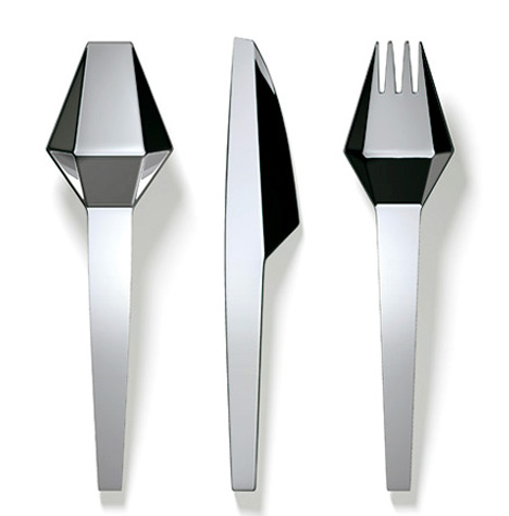

http://www.yankodesign.com/2007/05/18/cutt-cutlery-by-buchegger-denoth-feichtner-design/
Pratical? no! amazing and well suited to my work? (3d biz) YES!
To bad they cost about 1000 euros.. (8500,- kr) Goddamn these artists and their artsy, outofthisworld prices..
Oh-well, there is always something else:


I then came over these things and they are wicked!
http://www.yankodesign.com/2007/05/18/cutt-cutlery-by-buchegger-denoth-feichtner-design/
Pratical? no! amazing and well suited to my work? (3d biz) YES!
To bad they cost about 1000 euros.. (8500,- kr) Goddamn these artists and their artsy, outofthisworld prices..
Oh-well, there is always something else:
Friday, August 14, 2009
Fifty-Two Quick acting notes from Ed Hooks
Here are some tips that I myself find absolutely gold when animating.
I have these in the back of my head when animating as well as the twelve principles of animation. These are not rules meant to be followed specifically (your work would automatically be good just because of that) but think of them more as helpers. These tips from the worlds sweetest guy Ed Hooks apply to both Animators, Actors, Screenwriters as well as Directors. Use them well and double-check you work up against these. you will be amazed how much better and clearer your work will become. (It also help on speed and creativity process)
1. Scenes begin in the middle, not the beginning.
2. A character should be "doing" something 100 percent of the time.
3. A character enters a scene for a reason, and he exits for a reason.
4. Thinking tends to lead to conclusions; emotion tends to lead to action.
5. A gesture need not be an illustration of the spoken word.
6. Audiences empathize with emotion. The key to good animation is in empathy.
7. Comedy is drama heightened, oxygenated.
8. An action pursues a longer term objective. (Smile at the girl because you want to date her.)
9. Short term memory causes eyes to glance upward.
10. Long term memory causes eyes to glance downward, into the soul.
11. The human sense of sight is many times more powerful than the sense of hearing.
12. Humans act to survive. Find the survival mechanism in your character.
13. Play an action until something happens to make you play a different one.
14. A scene is a negotiation.
15. "Actors are athletes of the heart" - Artonin Artaud
16. Anxiety is a high or heady power center; confidence is a low power center.
17. Emotions are automatic value responses.
18. Characters that make steady eye contact for more than a few seconds are either going to fight or make love.
19. The human smile says, "I won't hurt you."
20. Never underestimate the audience.
21. When you animate, you are saying to the audience, "I understand this." When the
audience applauds, laughs or cries, it is saying, "I see what you mean."
22. Actors lead; audiences follow.
23. Background characters can be defined with shadow movement - a jiggling knee, a charcter's mouth moving when he reads the paper, biting fingernails and so on.
24. "The Iron Giant" is an animation classic. Every animator should study it, like visiting Mecca.
25. We see things before we hear them; we hear things before we touch them; we touch
things before we smell them; we smell things before we taste them.
26. A villain is a regular person that has a fatal flaw.
27. A hero is a regular person that has to rise to extreme heights to overcome an extraordinary obstacle.
28. The "beats" in a scene or script are better perceived as "beads" in a necklace. One bead leads to the next to the next and so on. Put the beads together, and you have a story.
29. The purpose of (character) movement is destination.
30. Acting has almost nothing to do with words.
31. Commercials convey almost zero actual information. They are about emotion.
32. Humans and other animals negotiate status continually.
33. To energize a scene, convert the character's "wants" to "needs."
34. Theatrical reality isn't the same thing as regular reality.
35. Acting is reacting.
36. Animators are not mimes. Mime is a specialized art.
37. A key ingredient of empathy is distance.
38. Old people stoop because their bodies ache.
39. A drunk character tries to counteract the effects of the alcohol.
40. To show that a character is hot, have him try to get cool.
41. To show that a character is cold, have him try to get warm.
42. An "adrenaline" moment is one the character will remember when he turns eighty and looks back on his life. The best movies include plenty of adrenaline moments. (Re-read #24)
43. A character analysis is like a character biography.
44. When a character is faced with a choice, be specific. Avoid ambivalence.
45. Allow your characters to be affected by the atmosphere in a location, the "feeling" it projects. (A car wreck has an atmosphere; a church has an atmosphere; a marriage bed
has an atmosphere.)
46. Yelling is a weak acting choice.
47. We speak of memory in general terms, but it is referenced in specific mental images.
48. A character that is listening to another is actually preparing to speak.
49. The camera tends to follow the character's gaze.
50. A scene should have conflict, otherwise known as an obstacle.
51. Trick for suggesting villainy: tilt head forward; eyes peer upward, exposing whites in lower portion of eyeball.
52. Character "personality" is actually character "behavior."
Source - http://www.ActingForAnimators.com
PS: Be sure to read Ed`s newsletters where he gives tips to aspiring actors/animators as well as sharing his view on the latest movies etc. Very good read!
Monday, June 22, 2009
Superb work by Matthew M. Laskowski, Student of the Art Institute in Boston
I love his style. Its a mixture of Gorillaz/passion pictures meets tank girl mixed with the wibe of Jet set radio/Mirrors Edge. Its also a subtle, minimalistic style similar to the animatrixs short "Beyond"
http://www.plasticshards.com/portfolio/


http://www.plasticshards.com/portfolio/
Friday, January 30, 2009
WipEout Stylists The Designers Republic Shuts Down

Sad news indeed.... =(
The UK design studio largely responsible for the identifiable visual style of Psygnosis' WipEout series, The Designers Republic has shut its doors after more than two decades in business. Why? Money problems.
The Designers Republic founder Ian Anderson tells the Creative Review that the studio, which handled visual work on titles like WipEout and WipEout XL, laid off all staff earlier this week. A seemingly perfect storm of cash-related issues ended the company, but Anderson says it will rise again in another form.
The design firm also worked on a handful of other video game related projects, including the PC game Hardwar and the original Grand Theft Auto. But it was probably the WipEout series with which The Designers Republic was most closely tied as the earlier games' typography, team design and icons were largely the result of their work.
MORE
Labels: design
Saturday, October 25, 2008
The making of MGS4

"June 12, 2008 saw the simultaneous worldwide release of Metal Gear Solid 4: Guns of the Patriots (MGS4) for the PlayStation 3. Gamers all over the world were waiting eagerly for this ultimate stealth mission game. No doubt they have already been captivated by its powerful gameplay.

MGS4 was a huge project that took Hideo Kojima, the virtuoso director, about three and a half years to complete. The Metal Gear series has been around for 21 years, with many people regarding it as a masterpiece in terms of its scenarios, gameplay and realism. Making a particular impact is its world-class graphics that go beyond the boundaries of a conventional game. These graphics give the action such realism and immediacy that players feel like they have been transported to a real battlefield.


In the development of MGS4, about 100 staff members were involved in the 3D content production. Extra personnel were added during busy periods, and by the final phase of development over 180 people were working on the project. By the end there were as many 40 programmers working on MGS4, including the work required for online compatibility. From the fact that such a large number of people were involved and it took three and a half years to finish, we can see that MGS4 truly was a mega-project.

The main tool used in this game with its world-class video graphics was SOFTIMAGE|XSI. We interviewed the Kojima Productions team after they had finished development and as the release date for MGS4 was approaching. In this interview, we were lucky to be able to speak with staff from all the major development units, including characters, background, machines, 2D, event demos, motions and programming. We learned a lot of interesting information, so this article has been split into two parts" - Source Yoshiyuki Watanabe
The article is about 2 pages long but manages to cover almost every thing from artdirection, animation to tips and tricks of the trade. A MUST read if your are at all interested in the inner-workings of this magnificent game or just curious about game process in general.
Read it here:
http://www.softimage.com/products/xsi/customer_stories/metal_gear_4/
Wednesday, January 23, 2008
Naturally Juicy: Behind the scenes
A look at the work done by the guys at The Mill in the making of their joint effort with Psyop to develop the popular commercial, Naturally Juicy.
End result
Making of: http://nofatclips.com/02008/01/21/orangina/The%20Mill%20-%20Orangina.mp4
End result
Making of: http://nofatclips.com/02008/01/21/orangina/The%20Mill%20-%20Orangina.mp4
Saturday, January 19, 2008
Behind the scenes of Alien vs Predator 2:Requiem
Hydraulx founders and VFX supervisors Colin and Greg Straus picked
Alien vs Predator: Requiem for their directorial debut and follow this link to read on the effects and making of AVP2

http://features.cgsociety.org/story_custom.php?story_id=4383&page=1
Alien vs Predator: Requiem for their directorial debut and follow this link to read on the effects and making of AVP2

http://features.cgsociety.org/story_custom.php?story_id=4383&page=1
Labels: 3d, design, movie news
Hell Ride poster
Even if it wasn't produced by Quentin Tarantino, HELL RIDE would still be looking like a whole lot of fun. I mean any time you get Michael Madsen, Vinnie Jones and Dennis Hopper together in the same movie, you're in for a good time. HELL RIDE is a throwback to the motorcycle films of the 70s with a dash of Sergio Leone thrown in for good measure. The film was written and directed by Larry Bishop (who also plays a role in the film) and follows a group of bikers who look to avenge the death of a woman at the hands of a rival gang, the Satanic 666ers. The film is showing at midnight screenings in Sundance so expect reviews to start pouring in rather quickly as word gets out. Shock Till You Drop has a first look at the poster today and it features some really bad-ass illustrations. So far no release date has been set for "HELL RIDE" but let's hope it's sooner rather than later.

Extra Tidbit: Bishop had a small role in KILL BILL as Larry Gomez.

Extra Tidbit: Bishop had a small role in KILL BILL as Larry Gomez.
Labels: design, movie news
Friday, January 04, 2008
Cool Stuff: X-Men Poster By Eric Tanner

This UFA German-inspired X-Men film poster was created by Disney designer Eric Tanner. He was responsible for some of the great retro "Incredibles" artwork.
“I’ve always dug those UFA German cinema posters, especially the Metropolis ones. Using them as inspiration, I sketched up a little comp on a napkin. They’re all gonna be sporting their retro uniforms and it’s gonna be like 3 colors max. I’ve cheated it a bit by including Wolverine and Storm. They came later in the series, but I like ‘em and it’s probably my one and only shot at working on the X-men so what the heck, right?”
“It was quite the honor to get to work on these characters that I’ve followed since I was a kid. In the end, it became a combination of the stuff I did for Incredibles and them old German film posters. Hope it works!”
I wish Marvel would release this on a one-sheet. I know I’d buy it.
Check out his blog here: http://erictanart.blogspot.com/


Subscribe to Posts [Atom]